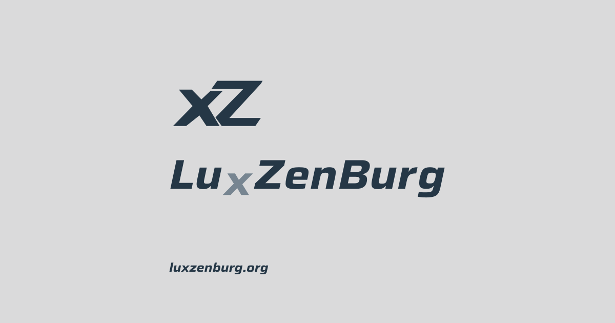
This site has a new visual identity. luxzenburg.org, luxzenburg.nl and luxzen.eu now form one family, each with its own colour. This one is platinum.
The xZ monogram is the favicon, the LuxZenBurg wordmark with the lowered x sits in the header, and the share image makes links to the site recognisable in feeds.
Why does the x drop? I spell my surname Luxzenburg, not Luxemburg like the country. That is no accident: in the 17th and 18th centuries my family name was still written van Lutzenburg, and in 1804 it suddenly became van Luxzenburg. The z and the n therefore differ from the modern spelling. In my original design the n jumped up and the x dropped, as a playful nod to that and because it suits my character. It also replaced the ‘t’ in 1804. I let go of the n, but the lowered x stayed: a small signature with a story.
The wordmark is set in Saira, a typeface with an open licence (SIL Open Font License). I don’t host any fonts myself: the letters are converted to vector paths in the image.
I explored the design with a few AI tools and did the Hugo integration with Claude Code. The choices are mine.
Small things, but they make a site more recognisable.